How to Build a Fully Responsive Website with CSS
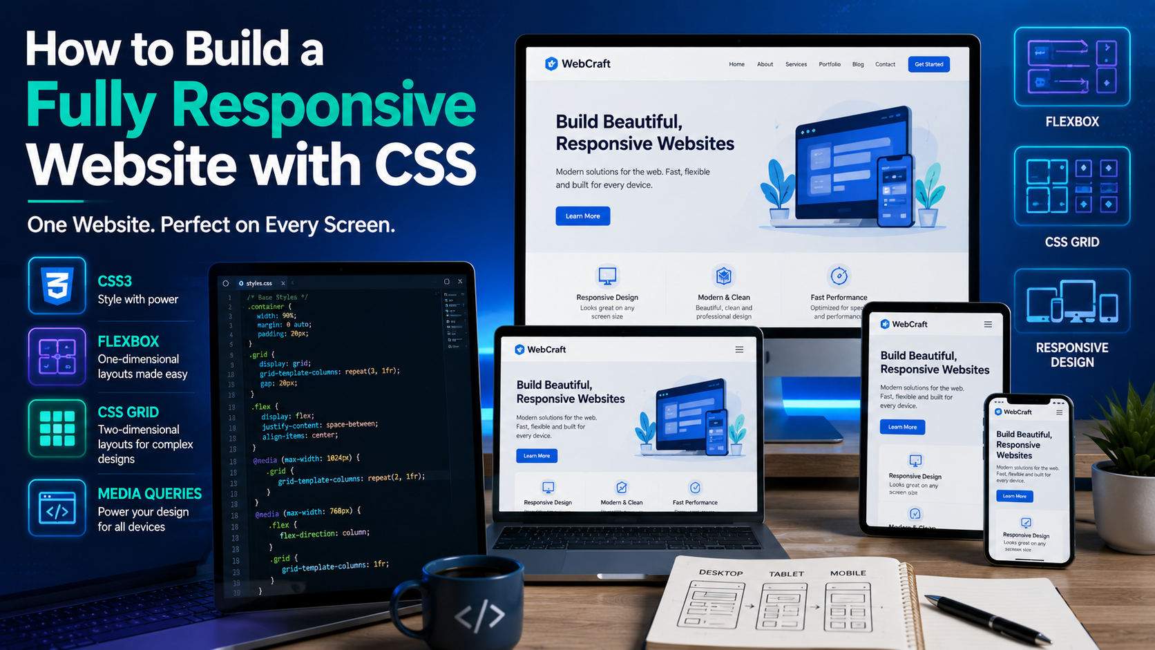
How to Build a Fully Responsive Website with CSS
Today's internet users browse websites on smartphones, tablets, laptops, desktop computers, and even smart TVs. A website that looks great on one device but breaks on another creates a poor user experience and may lose visitors.
This is why responsive web design has become an essential skill for every web developer.
In this guide, you'll learn what responsive design is, why it matters, and how to create websites that automatically adapt to different screen sizes using CSS.
What Is Responsive Web Design?
Responsive Web Design (RWD) is an approach to web development where a website automatically adjusts its layout, images, and content to fit the user's screen size.
Instead of creating separate websites for desktop and mobile devices, one responsive website serves all devices.
A responsive website should:
- Display correctly on all screen sizes.
- Be easy to read without zooming.
- Have buttons that are easy to tap on touchscreens.
- Resize images without distortion.
Provide a smooth user experience across devices.
Why Responsive Design Matters
Responsive websites provide several important benefits:
- Improved user experience.
- Better search engine visibility.
- Faster loading on mobile devices.
- Easier maintenance with one codebase.
- Increased engagement and lower bounce rates.
- Compatibility with future devices.
- Search engines also prioritize mobile-friendly websites, making responsiveness an important part of modern SEO.
Step 1: Add the Viewport Meta Tag
Every responsive webpage should include the viewport meta tag.
<meta name="viewport" content="width=device-width, initial-scale=1.0">
This tells the browser to match the page width to the device's screen width and render content at the proper scale.
Step 2: Use Relative Units Instead of Fixed Widths
Avoid fixed pixel widths whenever possible.
Instead of:
.container{
width:1200px;
}
Use:
.container{
width:90%;
max-width:1200px;
margin:auto; }
Relative units such as %, rem, em, vw, and vh allow layouts to adapt more naturally to different screens.
Step 3: Build with CSS Flexbox
Flexbox is excellent for creating responsive navigation menus and content layouts.
Example:
.container{
display:flex;
justify-content:space-between;
align-items:center;
gap:20px;
flex-wrap:wrap;
}
When the screen becomes smaller, the items wrap automatically instead of overflowing.
Step 4: Use CSS Grid for Complex Layouts
Grid is ideal for page layouts and content sections.
.grid{
display:grid;
grid-template-columns:repeat(auto-fit,minmax(250px,1fr));
gap:20px;
}
The layout automatically adjusts the number of columns based on the available screen width.
Step 5: Write CSS Media Queries
Media queries allow you to apply different styles for different screen sizes.
Example:
@media (max-width:768px){
nav{
flex-direction:column;
}
}
When the screen width is 768 pixels or less, the navigation changes from a horizontal layout to a vertical one.
Common breakpoints include:
576px (small phones)
768px (tablets)
992px (small laptops)
1200px (large desktops)
These values can vary depending on your design.
Step 6: Make Images Responsive
Images should scale with the screen.
img{
max-width:100%;
height:auto;
}
This prevents images from overflowing their containers while maintaining their original proportions.
Step 7: Create Responsive Typography
Text should remain readable on every device.
Example:
h1{
font-size:clamp(2rem,5vw,3.5rem);
}
The clamp() function allows text to grow and shrink within defined limits.
Step 8: Design Mobile-First
Mobile-first design means creating the mobile layout first and then enhancing it for larger screens.
Example:
.card{
width:100%;
}
@media(min-width:768px){
.card{
width:48%;
}
}
@media(min-width:1200px){
.card{
width:30%;
}
}
This approach keeps your CSS simpler and improves performance on smaller devices.
Example Responsive Layout
HTML:
<div class="container">
<div class="card">HTML</div>
<div class="card">CSS</div>
<div class="card">JavaScript</div>
</div>
CSS:
.container{
display:flex;
flex-wrap:wrap;
gap:20px;
}
.card{
flex:1 1 300px;
padding:20px;
background:#f5f5f5;
border-radius:8px;
}
This layout automatically rearranges cards based on screen size.
Common Responsive Design Mistakes
Avoid these common errors:
- Using fixed-width layouts.
- Ignoring mobile devices during development.
- Forgetting the viewport meta tag.
- Using oversized images.
- Creating buttons that are too small for touchscreens.
- Writing media queries that conflict with one another.
Testing your website frequently helps catch these issues early.
Best Practices
Follow these recommendations:
- Design for mobile first.
- Optimize images before uploading.
- Use semantic HTML.
- Keep navigation simple.
- Minimize unnecessary CSS.
- Test on multiple browsers and devices.
- Ensure sufficient color contrast for accessibility.
- Use consistent spacing and typography.
Helpful Tools for Responsive Design
The following tools can make responsive development easier:
- Visual Studio Code
- Browser Developer Tools
- Live Server extension
- Chrome Device Toolbar
- Firefox Responsive Design Mode
- CSS Grid Inspector
These tools allow you to preview and debug layouts on various screen sizes without needing multiple physical devices.
Frequently Asked Questions
What is the difference between responsive and adaptive design?
Responsive design uses flexible layouts that adjust continuously to screen size, while adaptive design uses predefined layouts for specific screen widths.
Is responsive design required today?
Yes. Most users browse the web on mobile devices, making responsive design an essential part of modern web development.
Do I need both Flexbox and Grid?
Yes. Flexbox is ideal for one-dimensional layouts, while Grid is better suited for two-dimensional page structures. Many professional developers use both together.
Conclusion
Building a responsive website with CSS is no longer optional—it's a standard requirement for creating professional websites. By using flexible layouts, media queries, responsive images, and a mobile-first approach, you can ensure your website provides an excellent experience across desktops, tablets, and smartphones.
Mastering responsive design will not only improve your development skills but also help you create websites that are user-friendly, accessible, and better optimized for search engines.
References
Coyier, C. (2024). A complete guide to Flexbox. CSS-Tricks. https://css-tricks.com/snippets/css/a-guide-to-flexbox/
Coyier, C. (2024). A complete guide to CSS Grid. CSS-Tricks. https://css-tricks.com/snippets/css/complete-guide-grid/
Duckett, J. (2021). HTML and CSS: Design and build websites (Revised ed.). John Wiley & Sons.
Frain, B. (2022). Responsive web design with HTML5 and CSS (4th ed.). Packt Publishing.
Marcotte, E. (2014). Responsive web design (2nd ed.). A Book Apart.
Mozilla Developer Network. (n.d.). CSS media queries. https://developer.mozilla.org/en-US/docs/Web/CSS/CSS_media_queries
Mozilla Developer Network. (n.d.). CSS Grid layout. https://developer.mozilla.org/en-US/docs/Web/CSS/CSS_grid_layout
Mozilla Developer Network. (n.d.). CSS Flexible Box Layout (Flexbox). https://developer.mozilla.org/en-US/docs/Web/CSS/CSS_flexible_box_layout
Robbins, J. N. (2023). Learning web design: A beginner's guide to HTML, CSS, JavaScript, and web graphics (6th ed.). O'Reilly Media.
W3C. (2017). CSS Grid Layout Module Level 1. https://www.w3.org/TR/css-grid-1/
W3C. (2018). CSS Flexible Box Layout Module Level 1. https://www.w3.org/TR/css-flexbox-1/
World Wide Web Consortium. (2024). Cascading Style Sheets (CSS) overview. https://www.w3.org/Style/C