CSS Grid vs. Flexbox: When and How to Use Each
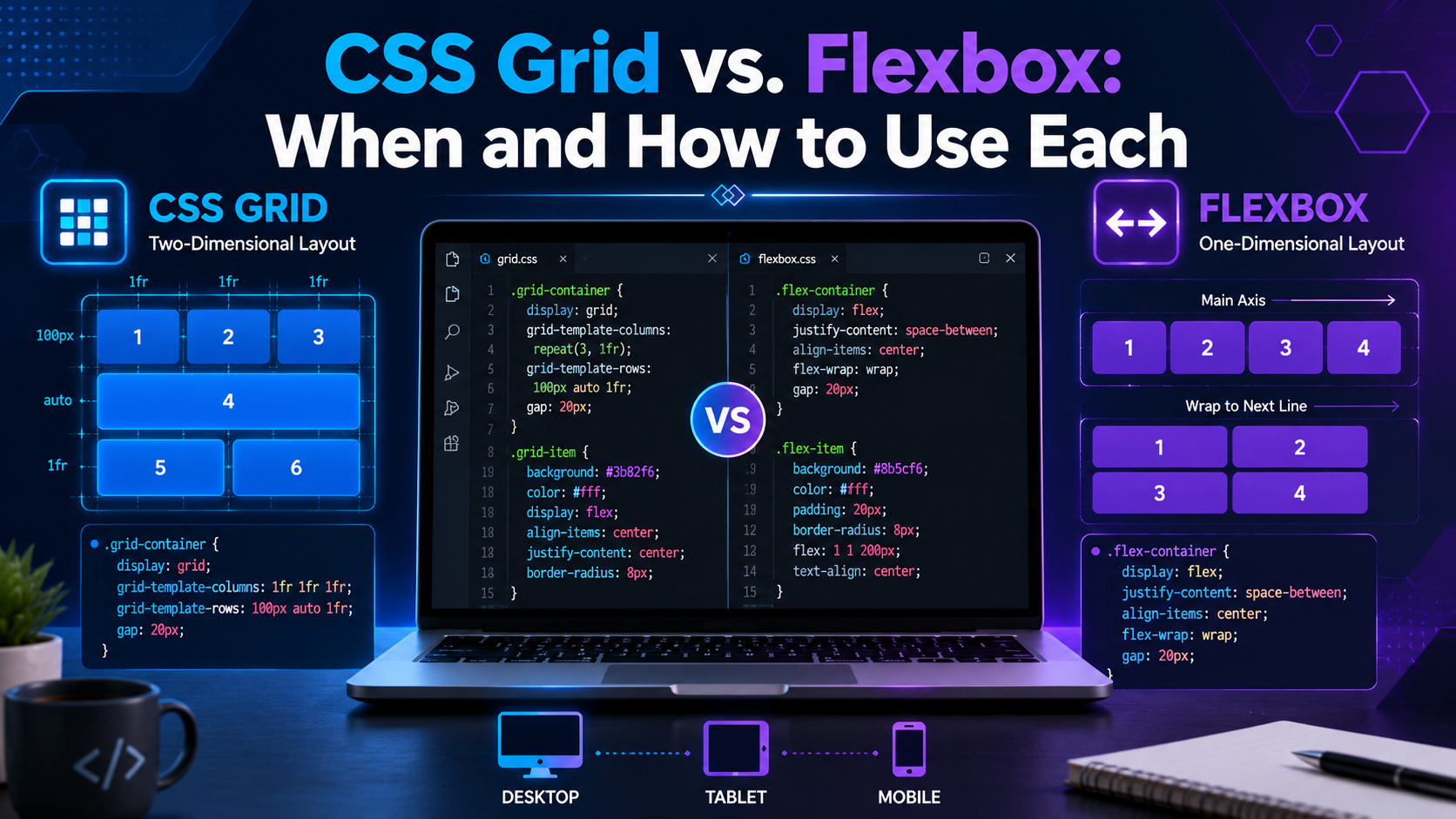
CSS Grid vs. Flexbox: When and How to Use Each
Modern websites must look great on desktops, tablets, and smartphones. CSS provides two powerful layout systems that make creating responsive designs much easier: CSS Grid and Flexbox.
Many beginners ask, "Which one should I use?" The truth is that both are excellent tools, and each solves different layout challenges.
This guide explains the differences, strengths, and best use cases of CSS Grid and Flexbox, with practical examples to help you choose the right one.
What Is Flexbox?
Flexbox (Flexible Box Layout) is a one-dimensional layout system. It arranges items in a single direction—either horizontally (row) or vertically (column).
It is ideal for aligning and distributing space among elements.
Example:
.container {
display: flex;
justify-content: space-between;
align-items: center;
}
Example HTML:
<div class="container">
<div>Logo</div>
<div>Navigation</div>
<div>Profile</div>
</div>
This creates a navigation bar where the items are evenly spaced and vertically aligned.
What Is CSS Grid?
CSS Grid is a two-dimensional layout system. It controls both rows and columns, making it ideal for creating complete page layouts.
Example:
.container {
display: grid;
grid-template-columns: 1fr 1fr 1fr;
gap: 20px;
}
Example HTML:
<div class="container">
<div>Card 1</div>
<div>Card 2</div>
<div>Card 3</div>
</div>
The browser automatically creates three equal-width columns with consistent spacing.
Understanding the Difference
Feature Flexbox CSS Grid
Layout Type One-dimensional Two-dimensional
Direction Row or column Rows and columns
Best For Components Full page layouts
Alignment Excellent Excellent
Complexity Easier More powerful
A simple way to remember the difference:
Flexbox organizes items in a single direction.
Grid organizes items in rows and columns at the same time.
When Should You Use Flexbox?
Flexbox is the best choice for:
Navigation menus
Buttons
Toolbars
Forms
Card alignment
Image galleries in a single row
Centering content
Vertical alignment
Example:
.menu {
display: flex;
justify-content: center;
gap: 15px;
}
This places menu items in a centered horizontal row with equal spacing.
When Should You Use CSS Grid?
Grid is ideal for:
Website layouts
Dashboards
Magazine-style pages
Product listings
Photo galleries
Landing pages
Admin panels
Example:
.wrapper {
display: grid;
grid-template-columns: 250px 1fr;
}
This creates a layout with a fixed sidebar and a flexible content area.
Flexbox Example: Centering Content
One of Flexbox's greatest strengths is centering elements.
.container {
display: flex;
justify-content: center;
align-items: center;
height: 100vh;
}
This centers content both horizontally and vertically.
Grid Example: Responsive Cards
.cards {
display: grid;
grid-template-columns: repeat(auto-fit, minmax(250px, 1fr));
gap: 20px;
}
This automatically adjusts the number of columns based on the screen size, creating a responsive layout without additional media queries.
Advantages of Flexbox
Easy to learn.
Great for aligning items.
Excellent for navigation bars.
Perfect for one-dimensional layouts.
Simple syntax.
Advantages of CSS Grid
Powerful layout control.
Handles rows and columns together.
Great for responsive designs.
Cleaner code for complex layouts.
Reduces the need for nested containers.
Can You Use Grid and Flexbox Together?
Absolutely. In fact, many professional developers combine both.
For example:
Use Grid for the overall page layout.
Use Flexbox inside components such as navigation bars, cards, and forms.
This approach provides flexibility while keeping your code organized.
Responsive Design Tips
Whether you use Grid or Flexbox:
Design with mobile devices in mind.
Test layouts on different screen sizes.
Use relative units such as %, rem, and fr.
Avoid fixed widths where possible.
Keep spacing consistent with gap.
Responsive layouts improve usability and can also contribute to better search engine rankings.
Common Mistakes Beginners Make
Using Grid for simple one-row layouts.
Using Flexbox for complex page structures.
Forgetting to test layouts on mobile devices.
Mixing fixed widths with responsive units unnecessarily.
Overusing nested containers.
Choosing the right layout system from the start makes your code easier to maintain.
Best Practices
Use semantic HTML with both Grid and Flexbox.
Keep your CSS organized and well-commented.
Name classes clearly.
Reuse layout components where appropriate.
Test your website in multiple browsers.
Frequently Asked Questions
Is CSS Grid better than Flexbox?
Neither is universally better. They solve different problems. Grid is best for two-dimensional layouts, while Flexbox excels at one-dimensional alignment.
Should beginners learn Flexbox or Grid first?
Many developers recommend learning Flexbox first because it is simpler. Once you're comfortable with Flexbox, learning Grid becomes much easier.
Can older browsers use CSS Grid?
Modern browsers provide excellent support for both CSS Grid and Flexbox. If you need to support very old browsers, review compatibility requirements before using advanced features.
Conclusion
CSS Grid and Flexbox are essential tools for modern web development. Understanding when to use each helps you create responsive, maintainable, and visually appealing websites.
As a general rule:
Use Flexbox for aligning elements within a component.
Use CSS Grid for arranging the overall page structure.
Mastering both technologies will significantly improve your front-end development skills and prepare you for building professional websites.
References
Coyier, C. (2024). A complete guide to Flexbox. CSS-Tricks. https://css-tricks.com/snippets/css/a-guide-to-flexbox/
Coyier, C. (2024). A complete guide to CSS Grid. CSS-Tricks. https://css-tricks.com/snippets/css/complete-guide-grid/
Duckett, J. (2021). HTML and CSS: Design and build websites (Revised ed.). John Wiley & Sons.
Frain, B. (2022). Responsive web design with HTML5 and CSS (4th ed.). Packt Publishing.
Marcotte, E. (2014). Responsive web design (2nd ed.). A Book Apart.
Mozilla Developer Network. (n.d.). CSS media queries. https://developer.mozilla.org/en-US/docs/Web/CSS/CSS_media_queries
Mozilla Developer Network. (n.d.). CSS Grid layout. https://developer.mozilla.org/en-US/docs/Web/CSS/CSS_grid_layout
Mozilla Developer Network. (n.d.). CSS Flexible Box Layout (Flexbox). https://developer.mozilla.org/en-US/docs/Web/CSS/CSS_flexible_box_layout
Robbins, J. N. (2023). Learning web design: A beginner's guide to HTML, CSS, JavaScript, and web graphics (6th ed.). O'Reilly Media.
W3C. (2017). CSS Grid Layout Module Level 1. https://www.w3.org/TR/css-grid-1/
W3C. (2018). CSS Flexible Box Layout Module Level 1. https://www.w3.org/TR/css-flexbox-1/
World Wide Web Consortium. (2024). Cascading Style Sheets (CSS) overview. https://www.w3.org/Style/CSS/